2019!

Happy to share this—I was able to carve out some time to make my limited edition holiday cards this year, after a year’s hiatus.

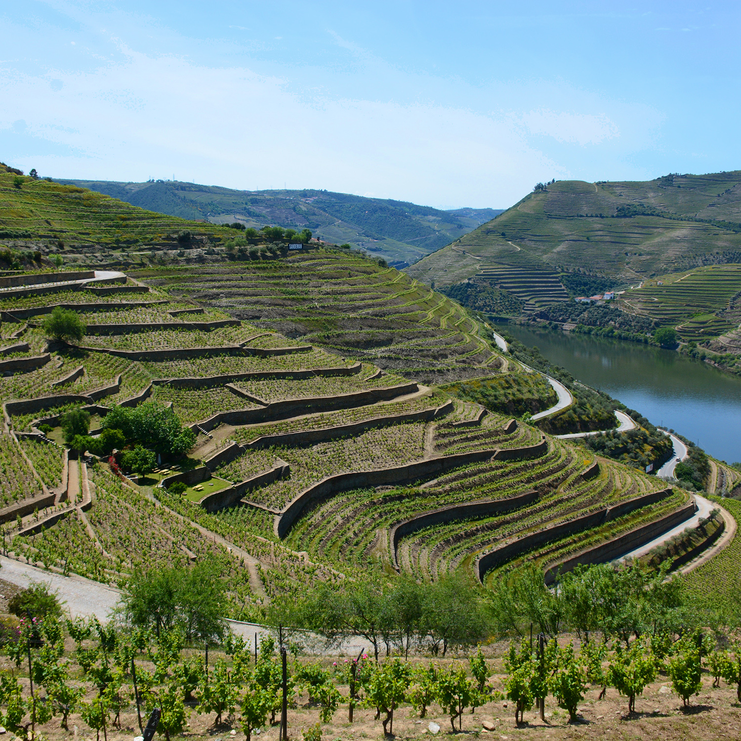
Inspiration: A view of the sunset from a friend’s home in Bernal Heights. I love the silver agains the glow of the sky.

As a designer rooted in CAD, I did the original drawings in Illustrator.

Designing for a handmade piece, I know the final design will morph. I tossed around a few different elements and ideas, like the gold dots, knowing they would require some real world experimenting.

An early test. This uses metallic gouache instead of printing ink, which gives a great shine but is almost impossible to print with. Also felt the diamonds were too busy.

An experiment with a more literal building reference. Too literal?

Maybe the background is unnecessary? Pretty, but more traditional than what I was going for.

Maybe the background is unnecessary? Pretty, but more traditional than what I was going for.

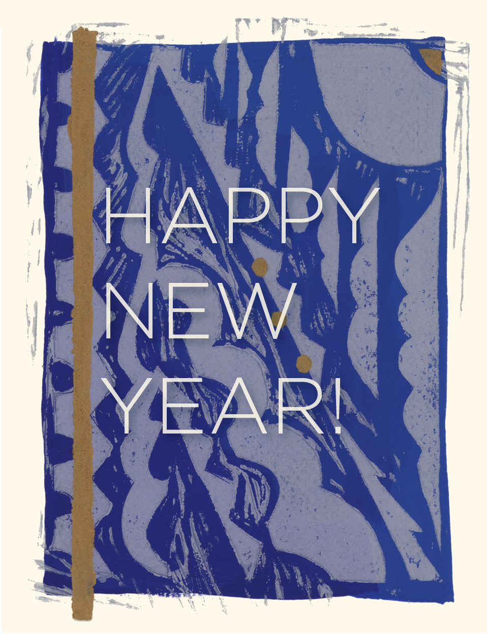
And, the final version, this year in two sizes.

Now for production!

Much gratitude to George, my freelance printer and handyman of art, who helped make 200 cards a reality!

My intention for 2019:

An abundance of inspiration, creativity, and fun projects for us all!

Textures of Burning Man

Dancing lights of the Hexatron, by Mark Lottor, 2018

For the past five years I have been packing out to the Nevada desert to attend/co-create/observe/endure the event known as Burning Man. It’s always quite a surreal and visually rich experience… fascinating textures and found patterns abound.

Lattices, lasercuts and overlays.

A gigantic, mechanical latticework orb contrasts the desert sky. The Ball by L’Enclave, 2015

Artists and makers and generally creative people set up projects, camps, and art pieces that seem to celebrate and spring from a really basic human instinct — to create something just for the joy or experience of creating it. The projects range from tiny and personal to epic in scope, requiring years of fundraising and scores of volunteers. Details about this year’s art are here.

Projections in the structure at the base of the Man give the impression of cyanotypes. 2018

Lots of opportunities for self-reflection. ;)

Fascinating mirrored facets, dulled by dust from the playa.

While it’s necessary in my everyday life as a designer to be always critiquing, always reviewing, always tweaking, it’s one of the great pleasures of Burning Man to be in a space amazingly free of judgements and criticisms of peoples’ creative output. The overall feeling is curiosity, openness, and gratitude to the individuals that make and share the projects. This aspect of the experience is really fun and freeing.

The surfaces of the playa. Images thanks to Tessa Thornberry.

This fantastical rearing horse was made to be animated by hand cranks. Barry Crawford 2018

Marvelous ingenuity repurposes everything from coins to muffin tins, creating mesmerizing details.

Strips of rusty metal form an imposing warp and weft.

Ursa Major by Mr and Mrs Ferguson was a favorite of mine in 2016. I would go admire this 14-foot grizzly almost everyday, and my visit always included a hug.

Daytime at Burning Man is all about biking around, looking at art projects, getting lost, visiting friends across the playa... and of course remembering to re-apply your sunscreen.

Glass circles provide found pattern. The image at right, taken by Tessa Thornberry, is of Bloom (an enormous jellyfish) by Peter Hazel, 2017.

But at night a whole different visual experience emerges, with led lights, propane flame poofers, bonfires and personal lighting— creating a fantastic array of colors and patterns.

The spellbinding lights of Paraluna by Christopher Schardt, 2018. This lovely piece was suspended overhead, and was accompanied by a soundtrack of classical music.

After dark, neon details make for a cool palette.

Our bars!

In addition to being an enthralled observer, I participate in the Golden Guy project; it’s an alleyway of tiny bars inspired by Tokyo’s Golden Gai neighborhood. There were 13 watering holes in 2018, each with a different proprietor and vibe. Shown above are the facades of our two pop-up bars Random Service and Blank Slate: every night is a different event and crowd.

Almost nightmarish from a distance, the found-object construction of El Pulpo Mecanico is charming at close range, as long as you are wary of the propane flames. This amazing creature, by Duane Flatmo and Jerry Kunkel, retired after 2016.

The eponymous burning Man, 2015

On Saturday night the Man burns. Always accompanied by fireworks and a serious soundtrack from concentric rings of artcars, this is the big event of the week. It’s catharsis is felt for miles.

In 2017 the man was housed in his own pavilion.

Sooty and mysterious bits and pieces are left after the burns.

Many art pieces are burned throughout the week, and the following day you can see interesting vestiges among the ashes. Some people collect charred fragments as keepsakes, but anything that remains is carefully cleaned and removed by the crews who made the art. The playa is returned to its natural state.

Photographer Jonathan Clark, a friend and campmate, captured this magical image of post-burn detritus.

Yep! Yours truly, a few weeks back, in my Burning Man finery including a vintage slip I screen-printed. Portrait thanks to Jonathan Clark. Image at right is detail from a wedding dress spotted in 2014.

All in all, it’s a challenging, hot, dusty, wonderful, inspiring, supremely silly and mind-bending experience. Now that all the dust is cleared and my gear is stowed til next year, I am hoping to find some time to take inspiration from some of these found patterns, set aside the inner critic, and see what I can create.

HAPPY BIRTHDAY PAUL POIRET! Textile Designer Birthdays

Poiret Post.jpg

I love the heady freedom of Poiret's impressive vision...lush fabrics, rich colors, bold prints, all creating maximalist and joyful whole.

Poiret Post5.jpg

Couturier, artiste, iconoclast, host extraordinaire: Paul Poiret was surely the greatest figure in the pre-World War I fashion world, and created the mold for the celebrity designer as we see it today. Yet he was unable to hold on to his fame and good fortune, and died in poverty.

Poiret Post2.jpg

Born in Les Halles on this day in 1879, Paul Poiret was sent to work as an umbrella maker's apprentice in his early years.  After a climb through the ranks at the fashion houses of the day, he launched his own shop in 1903. Unafraid to break with convention, he championed then-risque uncorsetted looks with the chemise silhouette, harem pants, culottes and kimono-like draped coats.

Poiret Post3.jpg
Poiret Post8.jpg

He loved free, naive pattern, and many beautiful prints in the archives of the great museums of the world are attributed to the man himself.  He also collaborated extensively with Raoul Dufy, and worked with artists like Dagobert Peche of the  Wiener Werkstatte.

Poiret Post4.jpg

His business met with enormous success, and in 1911 went into interiors with Atelier Martine. Ecole Martine was a school that he set up for young girls, who created designs for rugs and textiles and also learned rug weaving.

Poiret Post9.jpg

He believed that the Viennese schools were too rigid and wanted freer, more natural approaches. Field trips to the botanical garden were apparently part of the curriculum for the school, which was housed in the upper floor of his atelier. Artists and industry members would attend design critiques and help refine and select designs for production.

Poiret Post10.jpg

He was a master marketer, arbiter of taste, and patron of the arts, and enjoyed huge acclaim in the years before World War I. His mansion was designed by Louis Sue and his lavish parties were legendary. He was the first fashion designer to launch a perfume, and he even created licensed collections for global firms, including F.Schumacher & Co!

Poiret Post12.jpg

After serving as a military tailor during the war years, he returned to Paris in 1919 to find a weakened business and changing tastes. In the years following, his over-the-top approach did not serve him well, and he ended up selling his business (including the rights to his name) in 1929. The world was changing, but his great ability to predict trend and connect with his clientele were lost. Competition from the likes of Chanel ensured his downfall. A decline to poverty followed and he died penniless; Elsa Schiaparelli paid for his burial.

Poiret Post11.jpg

His joyful and free designs did prove to be influential well beyond his lifespan, and his appeal has proved timeless. An auction of his ex-wife's collection in 2005 brought great attention to his legacy, as did the Met's 2007 show of his work.

The Costume Institute at the Met, 2007

The Costume Institute at the Met, 2007

Now, 90 years after the demise of the firm, the fashion brand returned to the Paris runways this last spring.

The Poiret fashion house, relaunched

The Poiret fashion house, relaunched

And Schumacher has turned to its rich archives to debut a new collection of his exuberant patterns.  Inspiring to see these lush patterns finding an audience with a new generation almost a century after their creation.

Poiret's designs from Schumacher's Fashion Forward collection

Poiret's designs from Schumacher's Fashion Forward collection

Manus x Machina - Fascination in the Details

Dior

The venerable Met really has outdone itself with the current show at the Costume Institute.  Wow, what an amazing grouping of incredible textiles!  From the finest of traditional embellishments to mind-bending 3-D printed innovations, the fabrics used in these garments are worth a close look.  Here are details from my recent visit.

Karl Lagerfeld for Chanel

Iris Van Herpen

Fortuny

Chanel

Comme Des Garcons

Sarah Burton for Alexander McQueen

Poiret

Dior

Thom Browne

Louis Vuitton

Iris Van Herpen

Yves St. Laurent

Threeasfour

Yves St. Laurent for Dior

Raf Simons for Dior

Sarah Burton for Alexander McQueen

Raf Simons for Dior

The show has been extended to September 5th, so if you have the chance, check it out.

Treasures of Proposte 2016

Stunning Lake Como views.

Proposte is always a wonderful confluence of inspirations - top mills, amazing fabrics, and lovely people make it unmissable.  Add in the beauty of Lake Como, porcini season, and stunning weather, and you really have a special show. For a bit more background, please see Proposte 2015.

The front door to my apartment building, and a glimpse of Lake Como.

This year I stayed again in Como in an adorable AirBnB, and enjoyed my morning commute across the lake each day.  

Inspiring glimpses seen around town.

I share a love of travel with many designers.  There is something about being an a different environment that wakes up the senses and reveals many wonderful and inspiring details, and I always come home with too many ideas!

Intricate terrazzo details from the Proposte Villas.

There were many treasures to be found among the fabrics on show. As last year, the attending mills overflowed the Villa Erba into storefronts and hotels spread throughout Cernobbio and Como. The creme de la creme was on display at every turn.

Cuoium displayed and array of specialty and exotic leathers, including many fish leathers!

Van Maele impressed with beautiful sheers woven of true copper, as well as luxuriously hefty textures.

MUST plays with knits, heavy textures, and other innovative ideas.

Livable, elegant linens from Nelen and Delbeke.

Parry Murray showcased hand-touched fabrics with lovely, earthy character, including innovative discharge prints.

Deltracon's beautiful linens range from special trims to sheers to weighty upholsteries.

Highlights:

- Linen was a major star - heavy textures, usable jacquards and ethereal sheers made a great showing. Wool in many forms made a statement as well.

- Multi-color and color-fleck plains and textures were still looking fresh and emerged as an important evolution of the ongoing love of texture. Earthy handwoven looks dominated.

- Organic motifs, including marble and stone looks, mirrored layouts and woodgrains are still strong.  

- Antiqued, distressed and worn effects were seen in everything from epingle to jacquard to embroidery, and were often used to freshen traditional motifs.

- Complex prints were seen from many vendors. Unusual groundcloths continued to gain depth and interest, and were used in conjunction with digital warp prints, discharge prints, and raised inks. Prints as embroidery grounds created complex compositions.

- Color moved away from clean brights and into layered, sophisticated palettes, with an emphasis on mid-tones.  Pink and yellow-green were seen layered with charcoals, taupes and teals. Warm metallics continued, and the favorite themes of grey, cool neutral, and blue continued their dominance.

- Smaller scale wovens seem to be more important.  These textural jacquards are usually presented in livable, neutral tones and are great for large upholstered pieces.

- Dramatic and over-scaled engineered designs made a statement, in embroideries, prints and wovens.

- Velvets, epingles, and fabrics with pile looks continued the importance of softness and loft.

Always chic, Luilor featured usable textures and of-the-moment looks.

On my last day, I squeezed in and early morning visit to see the amazing trove of antique fabrics at Andre Heget.  An astounding archive tucked into an apartment not ten minutes from the Duomo, and a great source for antique and special textile documents of all kinds.  I found a few spot-on things for a current project; a great way to cap off the show!

Oh the treasures at Andre's!  If only I had a week to explore the range.

Arrivederci, Como.  See you next May!

Rainy Day Paper Marbling

On a blustery day last month I had the good fortune to attend a workshop in Western Paper Marbling. Such a remarkable experience!  

The workshop was held at the San Francisco Center for the Book, and was lead by Pietro Accardi, an Italian marbling expert who owned a bookbindery in Turin for over a decade.

Pietro provided all the arcane tools and materials necessary. (Seaweed emulsion, who knew?) He guided us through a series of traditional methods, showing us how to drop the paint onto the emulsion and manipulate it with handmade combs to create fantastic motifs. 

The process was totally fun and incredibly zen.  The set up is the complex part, but with Pietro's skilled instruction, all of us were able to turn out page after page of intricate, colorful examples of this old-world craft.

What a pleasure to fill a grey day with colorful swirls and curlicues!  

Textures of Maison et Objet 2016

I had a wonderful first-time visit to Maison et Objet this past January.  With over 3000 exhibitors spread across 8 halls, the show is a sweeping look at all that is happening in the home decor world.  My impressions of this dazzling array of style focused on texture and color.

Natural fibers and soft dimension for pillows and bedding.

Natural fibers and soft dimension for pillows and bedding.

Above: At Raga Designs, an array of hand-crafted pillows, throws and coverlets were beautifully executed and very understated, with great color accents against moody neutrals.

Delicately quilted silks in ethereal colors.

Above: Le Monde Sauvage is a French company with a beautiful assortment of bedding and pillows from across the globe.  Soft color and an air of bohemian luxe tie this irresistible collection together.

Fur and hides layer to create cozy texture.

Above: Fur and hides were everywhere and The Natures Collection has a wonderful array of soft and wooly options.

Knitted sisal is a delight underfoot.

Above: Based in Columbia, Valentina Hoyos brings a chic aesthetic to a collection built around natural dyes, indigenous handicrafts, and environmental stewardship. Meeting the creator of this refined collection was a real treat.

Heavy, rustic textures with plenty of organic variation were seen in rugs and baskets.

Cashmere and merino wool blankets in a variety of looks.

Layers of livable, sophisticated color were seen everywhere.

Ceramic offerings ranged from matte to crackle, with lovely hues and organic shapes.

Precious stone, leather and marbleized effects added decorative textures to many products.

Metallics from rustic to refined added their shine across the show.

It was an inspiring time, and the most inspiring aspect of the show was the drive and ingenuity of the small designers and craftspeople.  Their creativity was what stood out most. I left with a renewed respect for the power of design and the enduring importance of originality and authenticity in the work.  Many thanks to those intrepid authors and creators!

2016!

Hope you all had a wonderful and relaxing holiday season!

This year I was inspired to do a  set of limited edition cards to share holiday wishes...A further exploration into getting my hands dirty.  The card was created with a hand cut linoleum block printed  on a deep blue background.  

Here is a behind-the-scenes look at the making process:

Design draft, inspired by deco motifs and laid out to suggest a pine tree.

The carved linoleum block.

Technique and palette trials.

Painting the ground.

Painted cards ready for printing.

Burnishing tools.  Once the block is inked, the paper is applied, then the back of the paper is burnished to transfer the ink from the block to the paper.

Inking the block.

Production in full swing.

One of the final pieces...each card was a bit different, which added to the interest of the project.

I'm now working on a small collection of lino-cut allover patterns and will post them soon in Explorations.

All my best for an inspired year!

BLACK & NATURAL - An Inspiration Board

Stephanie Seal Brown recently sent out a card with an image of her classic hand-woven linen tapes.  I've been so into color lately, but the image really arrested me with the simplicity of the palette: just black and natural linen.  So I decided it was time for a new inspiration board.

Here is a detail of an ensō created by the Buddhist monk Thich Nhat Hanh. The piece was a gift from my mom after she attended one of his retreats.

A postcard of the Rosetta Stone that I have had since my first visit to London at age seven. Such a beautiful object!

I recently came across this very old study I made in gouache, inspired by Kay Nielsen's work. It's amazing how early inspirations stick with me —I still adore Nielsen's romantic illustrations.

I'm sure I am not the only designer who takes inspirations from the various bars and lounges around her home town.  Here is a terrific napkin from Zam Zam, a wonderfully broken-down cocktail bar in the Haight.

And finally, the impetus for the board.  Thanks, Stephanie Seal Brown!

Azulejo Português - Inspired Tilework

In early May, Matt and I got to explore Portugal for a few weeks--such a wonderful place. It was the wine that brought us, but I quickly fell in love with the Portuguese aesthetic, with its time-worn grandeur and earthy up-cyling traditions.

Discovering a country through its food, wine and culture is my favorite way to travel. We learned loads as we made our way though the enchanted Douro Valley, discovered elegant red wines in the Dao, and searched for wineries open to the public in Vinho Verde country. The port houses of Vila Nova de Gaia and the small wine bars tucked into the picturesque alleys of Porto added to the fun of the journey.

For a designer the country is a visual treat. Many generations of Portuguese have adorned their surroundings with lovely touches, from tooled leather to inlaid wood to faux stone painting. Perhaps most marvelous of all are the ajulejos, or tiles. Especially in Lisbon, building after building is covered in decorative tile. Repeating patterns and wonderful textures and colors abound as far as the eye can see.

Composição, a tile panel by Querubim Lapa (b 1925)

The Museu Nacional do Azulejo in Lisbon houses quite a scholarly collection that covers the history of tile-making in Portugal, from its Moorish roots up though very conceptual contemporary works. The pieces that most enchanted me were 20th century works, in particular tile panels made by Querubim Lapa. Stunning. 

The facade advertises the cuisine at this fish restaurant

From subway walls to simple townhouses, restaurants to churches, examples of tiles of all qualities, colors and styles dazzle your senses.

I came home with a camera bursting with colorful images of the rich and sometimes over-the-top drama of Portuguese decorative art, often made more soulful by the wear of time and the layering of texture.  I'm looking forward to taking some of these lovely and time-honored inspirations and putting a new spin on them!

A modern building in Lisbon. Tile detail shown below.


DIP DYE - Exploring Indigo

After a few years of hands-on design at the Fashion Institute of Technology—focusing on weaving, painting and screen-printing—most of my career has been spent on digital design, as well as collection styling and project management.  I love design on the computer.  Photoshop and Illustrator have become my go-to tools for creation.  But after so much time spent clicking away on the mouse and Wacom tablet and screen, I am rediscovering the creative spark of rolling up my sleeves and making something. It’s good to get your hands dirty from time to time, and after a day of indigo dying in a friend’s back yard last year, I’ve gotten hooked.

The results of a day in the yard

A set of vintage heavy linen placements and a set of new linen napkins with a simple blue border

Indigo dye folkways run deep.  The committed craftsmanship of the dye-master, the artistry of Shibori…these are at once inspiring and petrifying.  How to approach such a venerable craft as a beginner?  Just have to jump in, and with beginner's mind learn and enjoy the process.  I view these pieces as experiments: explorations that allow me to re-invent collected and beloved swatches and vintage linens, "sketches" that can serve as building blocks for digital design. 

Our home improvement projects have yielded a plethora of clamps and wood scraps, shown here with the dye baths.  The clamps work well for suspending the bordered items in the dye bath, as well as creating the resist areas.

Border design exploration

Process for creating a border

Estate sale finds given a new life: a lovely fat hemstitched placemat set and some jacquard linen napkins, all after 24 hours in the blue.

Each piece in a set has its own personality

Careful folding and clamping results in a bordered plaid

I like to play with simplified designs and techniques to allow modern motifs to come through.  The juxtaposition of the organic, hand-dyed texture with simple borders, blocks and stripes creates a wonderful tension. I love to find old monogrammed and stitched linens that seem too formal for an everyday setting, give them a dip in blue, and use them with tonight's cocktail or Wednesday's dinner.  Why not?

Cheers!

PROPOSTE - A Dreamy Trade Show in a Dreamy Setting

For the world of high-end home furnishings fabrics, the place to see and be seen is Proposte, a trade show that happens each May at the charmed location of Cernobbio, a town on the banks of lake Como in Northern Italy. The show is focused on high-end European mills, especially Italian vendors, specializing in upholstery and drapery fabrics.

The fairground is called Villa Erba, and consists of a low modern glass building where mills exhibit and a historic mansion where a very civilized lunch is served. In addition to the 95 manufacturers that show at Villa Erba, Proposte expanded the footprint to include a few added sites that make space available for mills from other regions, with an emphasis on India and Turkey. The town of Cernobbio is taken over by the show, with additional mills setting up shop in every available space, from the grandest of stand-alone, lake-view villas to tiny shopfronts and hotel conference rooms.

This year I stayed in a chic little apartment in the town of Como, which offers more in the way of restaurants and shops than Cernobbio.  Each morning I boarded a boat from Como to the fairgrounds, possibly the most romantic commute in the world when the the weather is fine.  This year we had rain for two of three days, which made the ride a bit more of an adventure.

Many luxe and wonderful fabrics were on display, and I noticed these trends:
- Naturals, with an emphasis on linens and textures, are still huge.  Mills get creative by adding interesting fibers--could be wool or a higher tech synthetic--to make the look interesting.
- Distressed finishes like stone wash, basket dye, enzyme wash, and other  techniques were seen everywhere as vendors explore the trends of broken down and faded looks. Tie-dye, dip-dye, and ombré played into this organic trend. 
- Re-invented classics were to be seen in many displays, with over scaled frame damasks, flame stitch looks in updated colors, and classic florals of every hue.
- Multi-color chunky tweeds à la Coco Chanel made a big comeback. 
- Experimental technique including dimensional and puckered weaves, and knit and warp knit looks for window and accessory added dimension. 
- In color, neutrals continued, especially cool tones and soft blues.  Strong shades like kelly green, fuchsia, and teal could be seen as accents as well as statements. An emerging palette is a shimmering multi-pastel, looking like abalone or bubble soap. Multi-color and multi-tone effects using space dye, complex weaves, and digital prints.
- Embellished and embroidered continue to be important.  Large scale and richly embroidered fabrics made a statement. 
- Velvets, epinglés, and other heavy textures were important, and used a broad fiber range with lots of wool, alpaca, and silk.
- Metallics of all tones, especially warm, with some mills using innovative yarns with metal wraps and fabrics with stainless steel content.  Very cool!

IMG_5365.jpg

Such an inspiring location, and so many great fabrics.  Looking forward to 2016!

News... Coming Soon

I am looking forward to sharing images and inspiration from my upcoming journey to Italy, Portugal & Amsterdam.


The trip will start in Como, where I will attend Proposte, a fantastic fair of European home textiles mills. Next leg will be Portugal, where Matt will meet me for a trip to taste wine, see inspiring sights and discover a culture new to us. Final stop will be in Amsterdam to connect with old friends.

Please check back or sign up for updates.

©2015 Saana Baker Design. All rights reserved.